01Challenge
Create a striking visual language for an eyewear brand, in a market where almost every campaign looks the same.
PRT-06NVO · 06/08
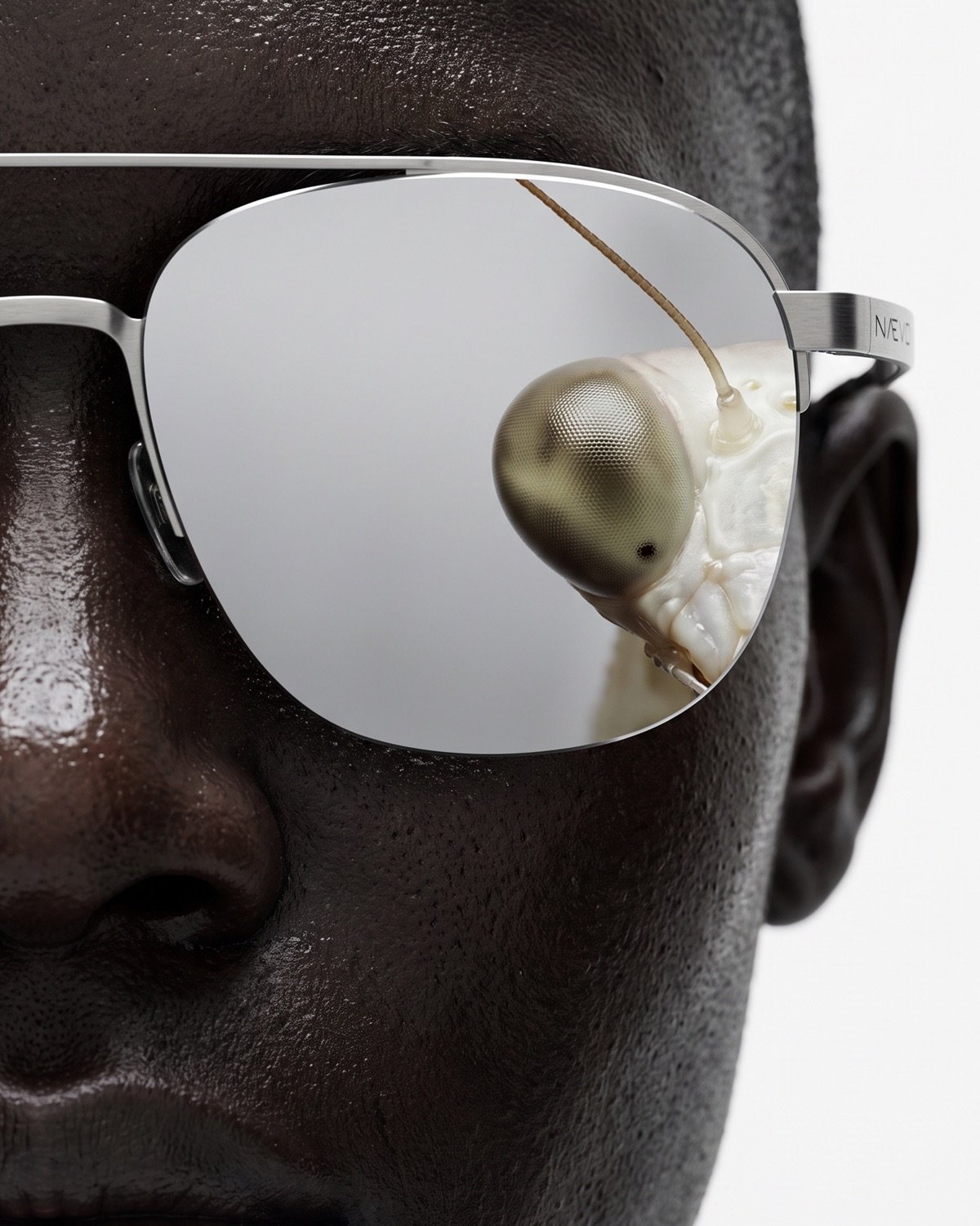
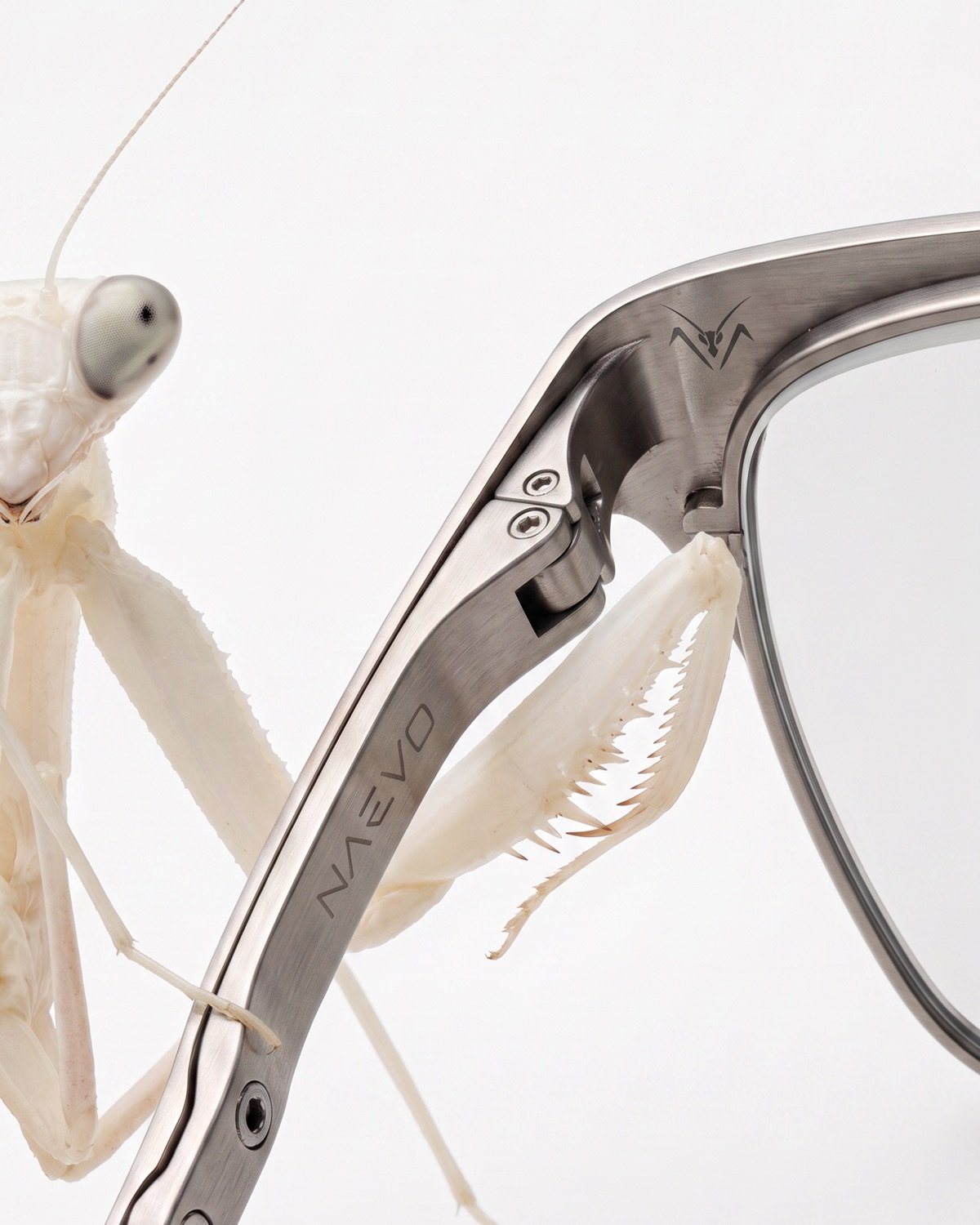
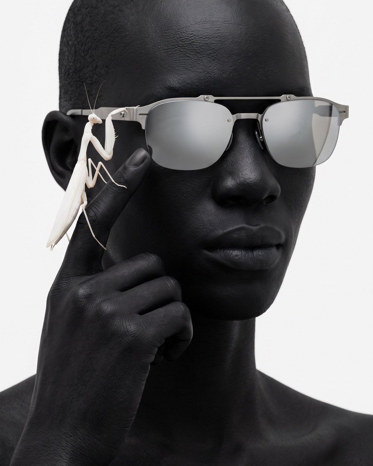
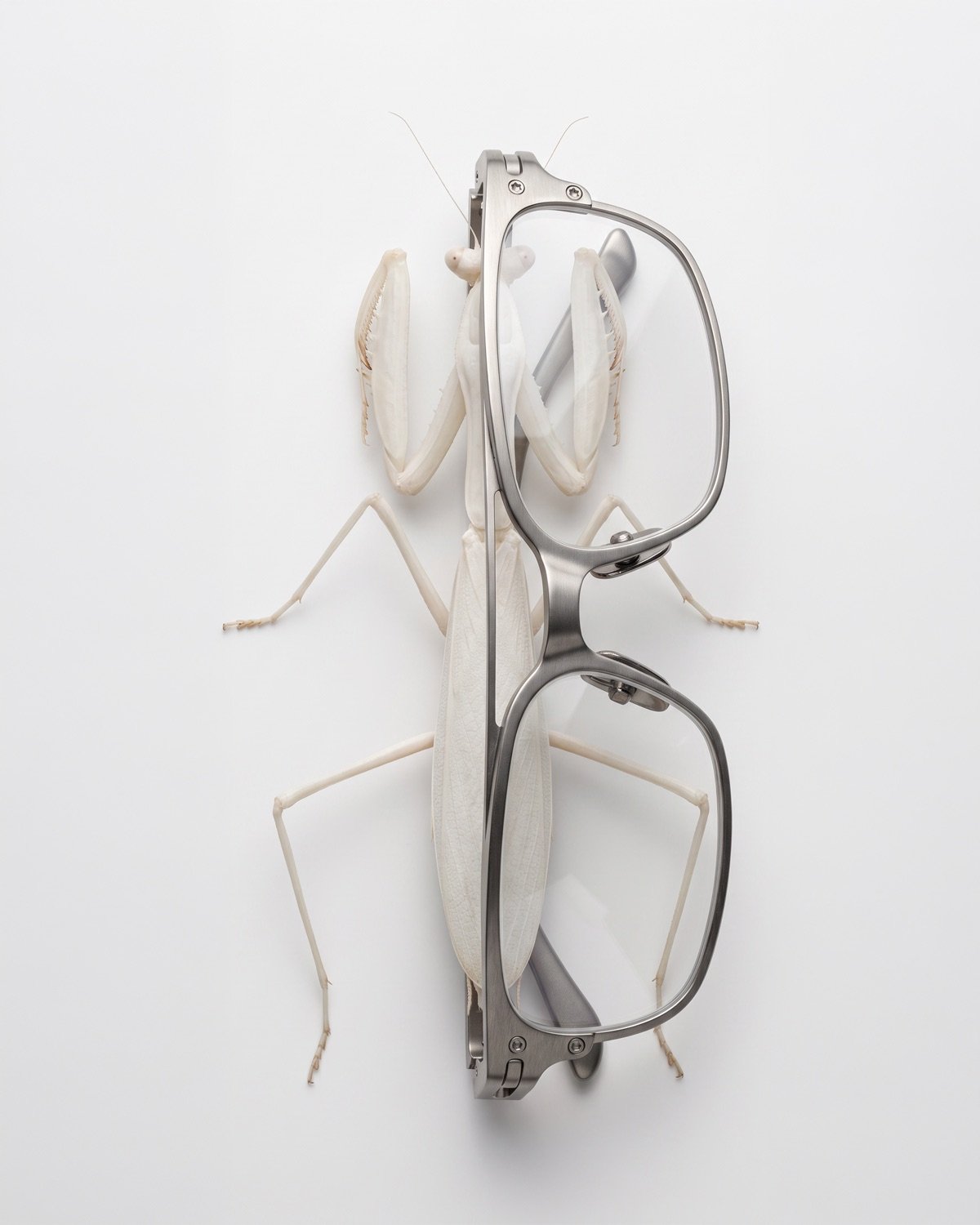
An eyewear campaign built on contrast and strangeness.

01Challenge
Create a striking visual language for an eyewear brand, in a market where almost every campaign looks the same.
02Approach
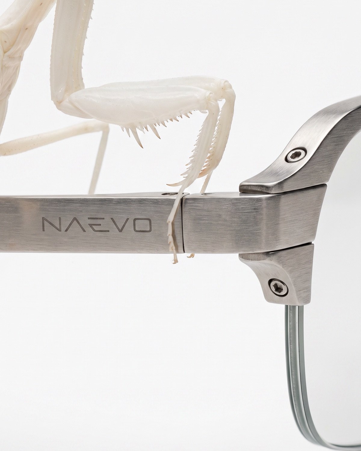
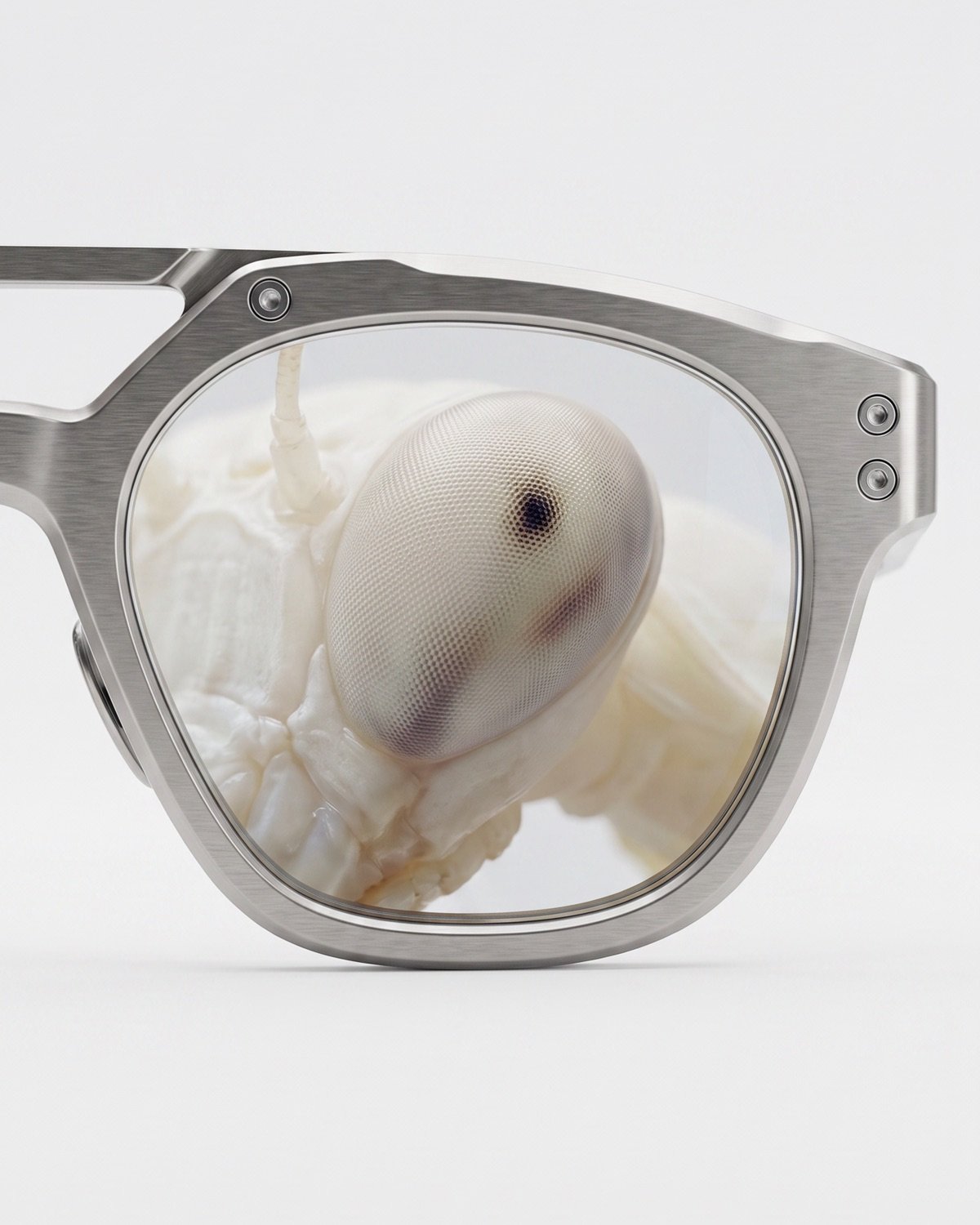
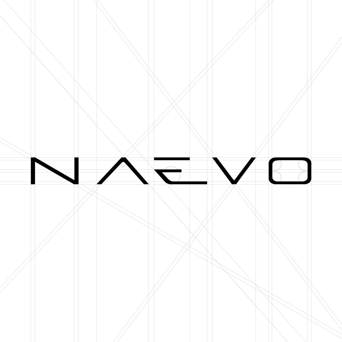
The wordmark uses thin, geometric letters — an A without a crossbar — that echo the precision of the frames. The campaign bets on contrast and strangeness, placing a praying mantis beside the product to create images that stop the scroll, on light backgrounds with plenty of breathing room.
The brand in movement.
From the first sketch to the final construction — how the mark was found.
Got a brand to build?
Start a brief